Nobl9 application (1.69.2)

Release details
new Service health dashboard by burn rate
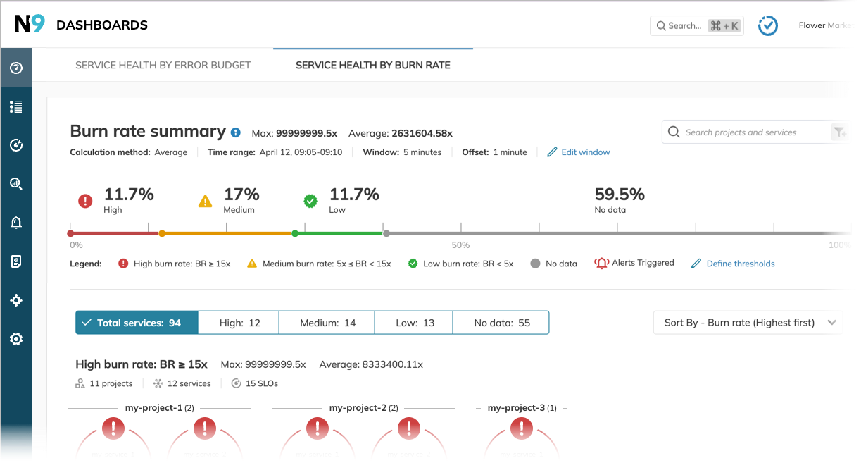
We are thrilled to announce another flavor of the Service health dashboard that visualizes the health of the services based on the current burn rate values of their SLOs. So you're always aware of your services' current state and can react before the error budget is critically low.
The new Service health dashboard offers a comprehensive snapshot of the service status, providing an operational overview vital for troubleshooting and support communications and driving informed executive decisions during ongoing incidents. Real-time service health visualization helps you quickly pinpoint areas that require attention or action.

Identify unreliable services at a glance. The new Service health dashboard categorizes services by reliability and displays them on a line graph. Drill down for detailed stats on projects, services, and SLOs within each category for streamlined monitoring and management.
Empower flexibility and alignment:
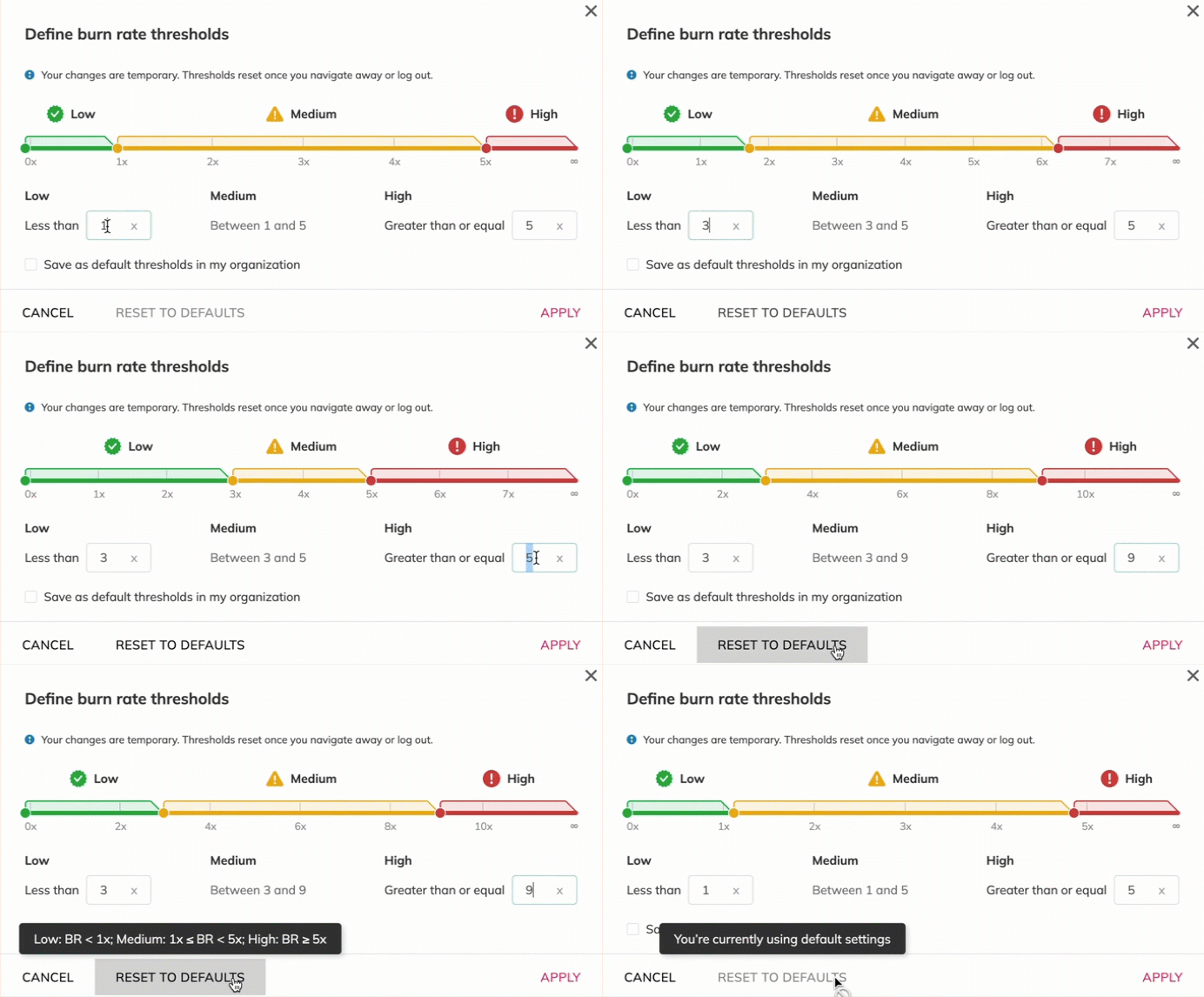
- Editable org-wide defaults for the burn rate—foster shared understanding of healthy service parameters.
- At-a-glance insights—color-coded graphs make service health instantly apparent and facilitate quick assessments.
- Tailored monitoring—focus on immediate impacts or long-term trends with customizable timeframes (5-30 minutes).
- Seamless collaboration—share custom views with deep links to keep teams aligned.
