Service health dashboard
Service health dashboard summarizes the reliability of services in your organization. The dashboard targets product managers or executives who do not require a granular view of each SLO and instead are looking for a holistic view of reliability within their organization. Engineers or SREs can also use it to see a snapshot of the current state of their environment and drill down for more information.
The dashboard gives an aggregated view of the overall organizational health. It groups the services into three color-coded categories according to the settings and uses the project-service-SLO hierarchy.
Service health dashboard features two views for more comprehensive analysis:
- By error budget
- By burn rate
Select Service Health by Error budget to view services grouped by the severity of error budget exhaustion calculated over the current time window.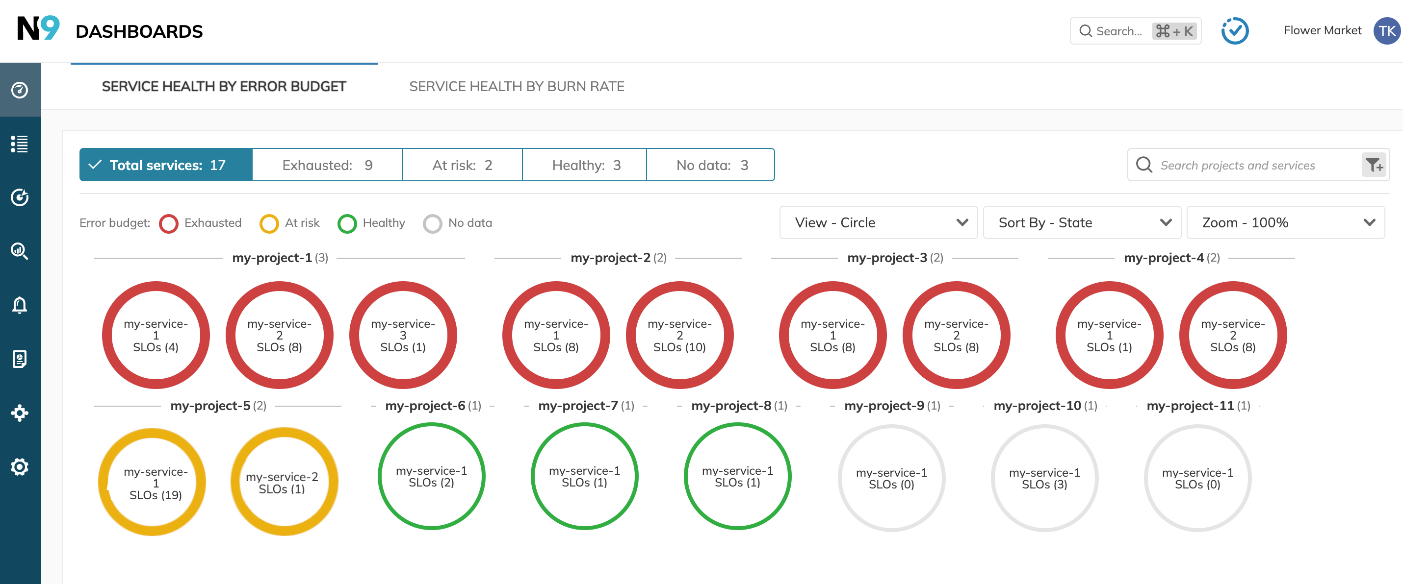
You can select the way the services are displayed on the dashboard. Choose the required option in the View list under the dashboard header. The following options are available:
- Donut: Visualizes the proportional breakdown of SLO health statuses within each service using a donut chart.
- Circle: Represents each service as a colored circle.
- Circle with Icon: Similar to the circle view, but includes an icon.
Select Service Health by Burn Rate to view services grouped by their burn rate value calculated over the latest period, set by the time window.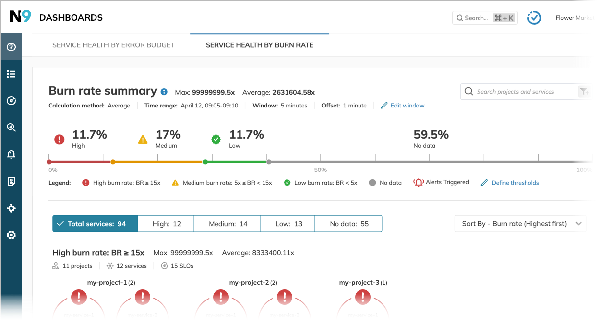
Monitoring health of services
The color-coded categories mean the available error budget of the SLOs or their burn rate, depending on the dashboard type.
Service category is determined by the lowest-performance SLO it holds. The category rules are as follows:
| Measured by | Healthy Low | At risk Medium | Exhausted High |
|---|---|---|---|
| Error budget | Above the upper threshold | Between the lower and upper thresholds | Hits the lower threshold |
| Burn rate | Low burn rate | Medium burn rate | High burn rate |
| SLO performance | All SLOs are healthy All have low burn rate | No exhausted SLOs; at least one at-risk No SLOs with high burn rate; at least one with medium | At least one exhausted SLO At least one SLO with high burn rate |
When no data is reported by SLOs in a service or if the error budget calculation isn't finished yet, the service falls into the No data category.
Services are displayed on the dashboard under the projects they relate to. When a project contains services that fall into different categories, you see this project under all matching categories.
A service can fall into the No data category when any of its SLOs has combined query interval and query delay values greater or equal to the dashboard's time window. This makes the time window too short for categorization—Nobl9 lacks time to accumulate data. Learn more about data source and SLO troubleshooting.
To narrow down the number of No data services, try increasing the offset.
Service health by error budget
Service health by error budget shows the health of your services from the perspective of their error budget.
Services are categorized based on an SLO with the lowest error budget they hold. Error budget thresholds define the category boundaries.
For example:
| Service X At risk | Remaining error budget | Service Y Exhausted | Remaining error budget |
|---|---|---|---|
| SLO X-A | 84% | SLO Y-A | 84% |
| SLO X-B | 45% | SLO Y-B | -55% |
| SLO X-C | 9% | SLO Y-C | 9% |
| SLO X-D | 19% | SLO Y-D | 19% |
| SLO X-E | 95% | SLO Y-E | 95% |
Error budget thresholds
You can modify the error budget thresholds to evaluate the health of your services from a different perspective.
For this, click Define thresholds under the service percentage scale and set the required values. As a result, the dashboard changes the service breakdown, and the deep link to the dashboard contains your updated values. So you can save and share it further.
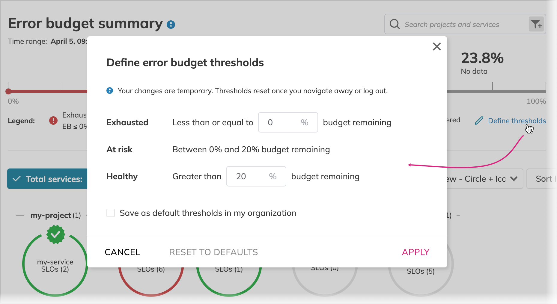
Your changes are only applied to your current session and aren't visible to other users. Once you switch the dashboard, navigate to any other Nobl9 section, or log out, it returns to its default values.
When your role permissions allow, you can set new defaults for the entire organization. For this, select Save as default in my organization before applying your changes.
Burn rate thresholds set for the dashboard are also applied to filter the SLO list by error budget status.
Service health by burn rate
Service Health by burn rate uses thresholds for Low, Medium, and High burn rates. Services are evaluated over the specified time window and fall into these categories, according the set thresholds.
The dashboard is dynamic and refreshes every minute.
The dashboard displays the maximum and average burn rate values for the whole organization and per category.
- The Maximum is the highest burn rate among the SLOs.
- The Average is the arithmetic mean of burn rates across the SLOs.
Burn rate time window and thresholds
You can modify the time window and thresholds to access the health of your services from different perspectives.
Upon time window and thresholds editing, the dashboard changes the service breakdown, and the deep link to the dashboard contains your updated values.
Your changes are only applied to your current session and aren't visible to other users. Once you switch the dashboard, navigate to any other Nobl9 section, or log out, it returns to its default values.
To check the current defaults with the modified time window or threshold values, hover the cursor over Reset to defaults.
If your role permissions allow, you can change the default time window, offset, and thresholds for the entire organization. For this, select Save as default in my organization before applying your changes.
Time window
The time window is the interval of the burn rate evaluation. To modify it, click Edit window.
Relatively narrow time windows can be the reason for services falling into the No data category.
This occurs because SLOs in such services bring data for a given period after the time window rolls further, leaving no time for collection and categorization.
Since the frequency of data collection depends on SLO query interval and query delay (if any),
increasing the time window can address this issue.
So,
set the time window greater than the longest combined query interval and query delay among SLOs in the affected service.
This gives enough time to collect data and categorize the service, preventing it from falling into No data.
Another remedy for this is adding the offset to the time window. Offset moves the time window without impacting its range. For example, when the time window is 5 minutes with a 1-minute offset, the dashboard will still ask for 5-minute data; however, the time window shifts for 1 minute backwards, i.e:
- Time window = 5 min; now is 15:00
- Offset = 0 min
The dashboard asks for data received from 14:55-15:00 - Offset = 1 min
The dashboard asks for data received from 14:54-14:59
- Offset = 0 min
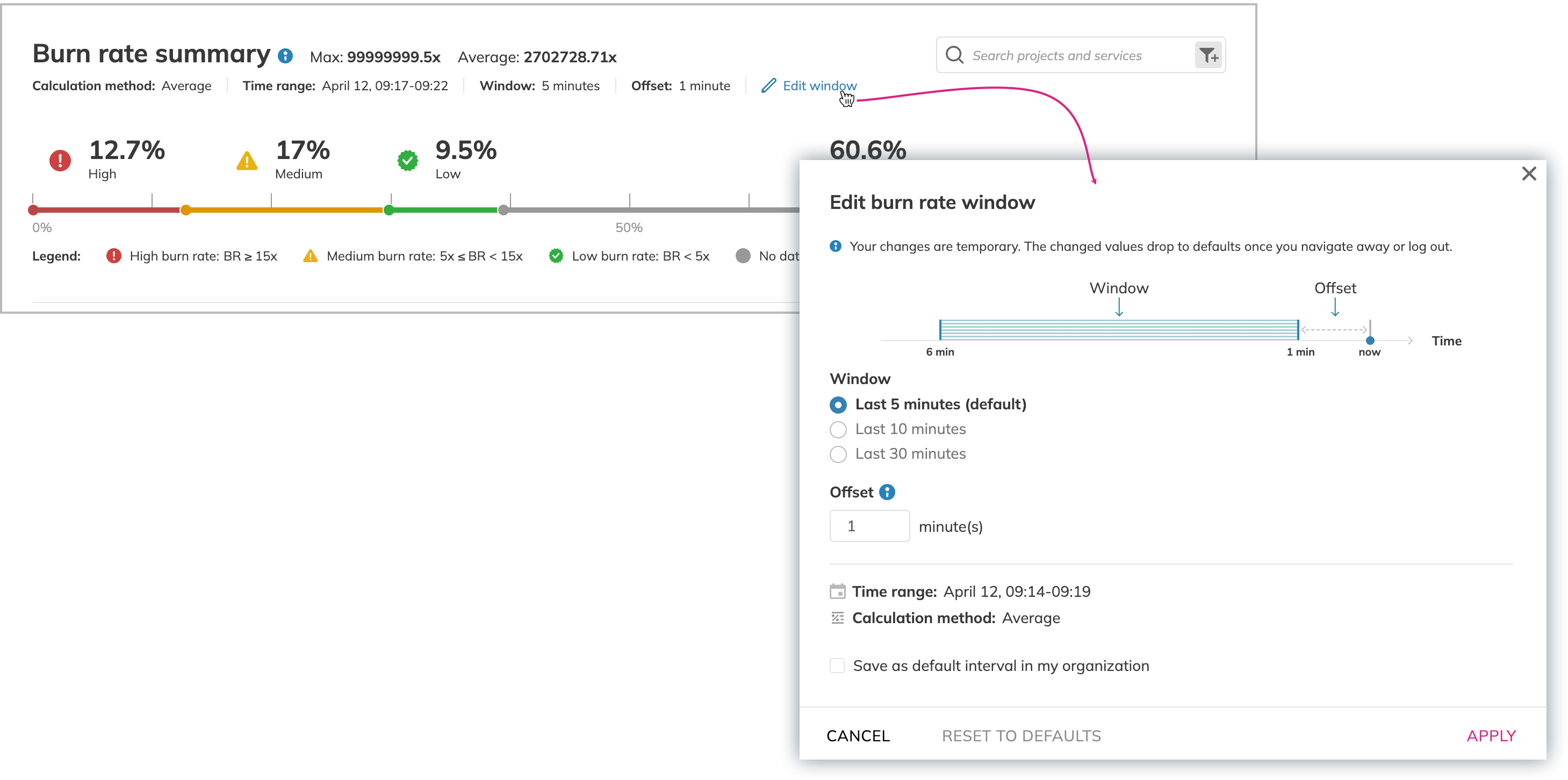
While offset gives a head start for SLOs with low querying frequency, it lets old data from frequently updated SLOs at the same time.
Thresholds
The thresholds determine the category criteria. To set other thresholds, click Define thresholds:
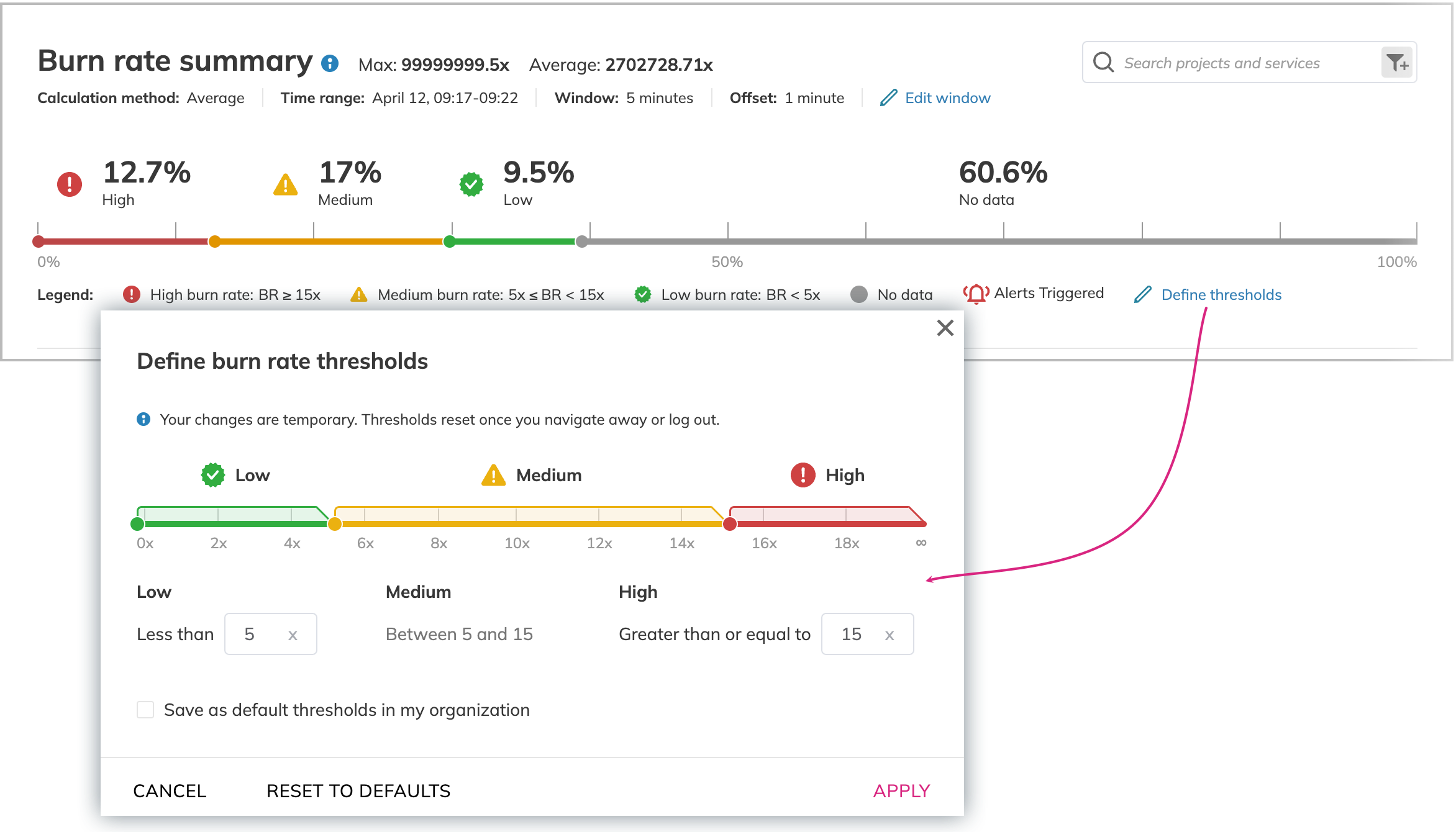
Based on the thresholds set in Image 3, the dashboard groups services as follows:
- The burn rate increases 15-fold or higher—this service falls into the High burn rate category
- The burn rate increases 5- to 15-fold—this service falls into the Medium burn rate category
- The burn rate doesn't increase, or its increase doesn't reach 5-fold—this service falls into the Low burn rate category
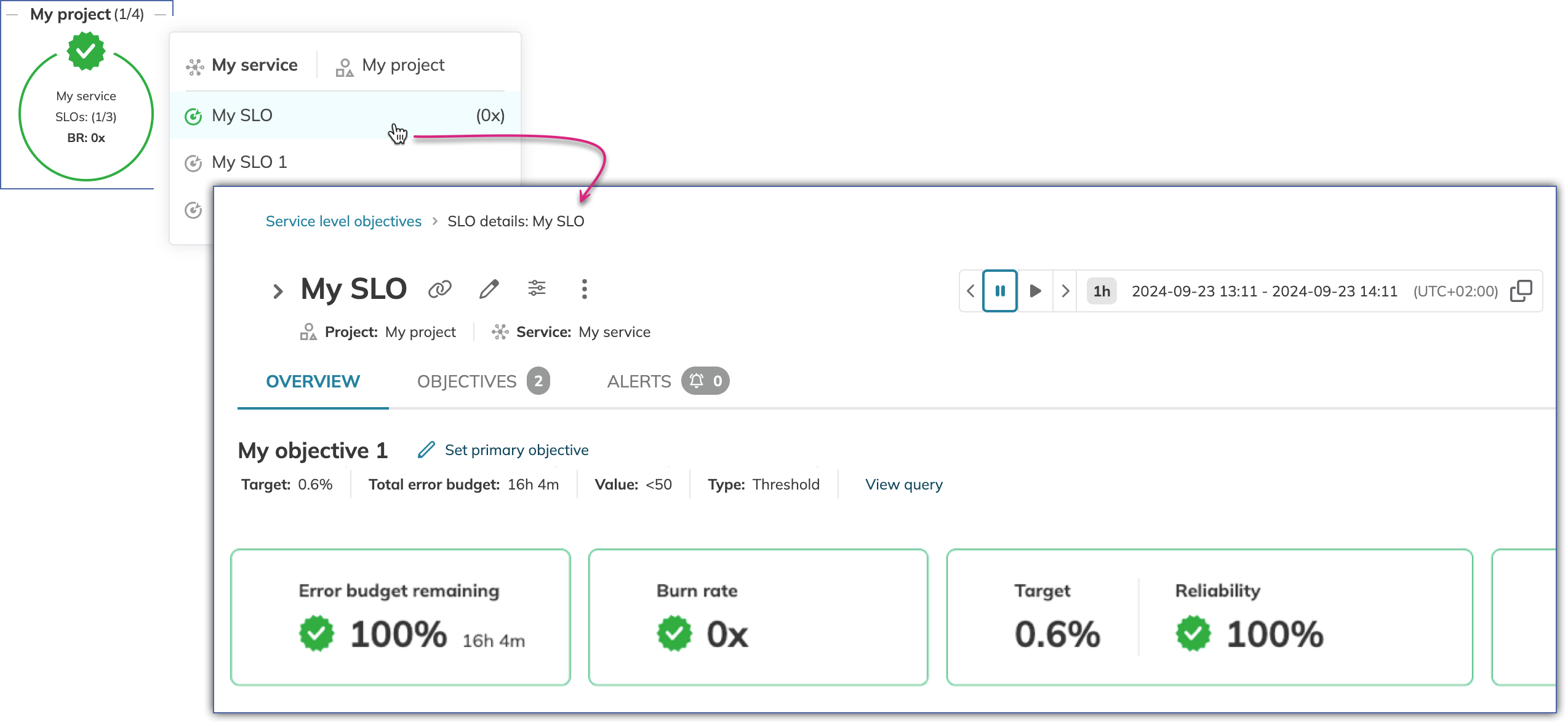
Accessing service details
To view the details of a service on the dashboard, click the tile with the required service. It opens the list of SLOs this service holds ordered by the remaining error budget or burn rate.
- For standard SLOs and default sorting, Nobl9 displays the most alarming SLO first:
- Service Health by error budget: the SLO with the least remaining error budget
- Service Health by the burn rate: the SLO with the highest burn rate
Click the SLO to open its details page:
Dashboard filtering and sorting
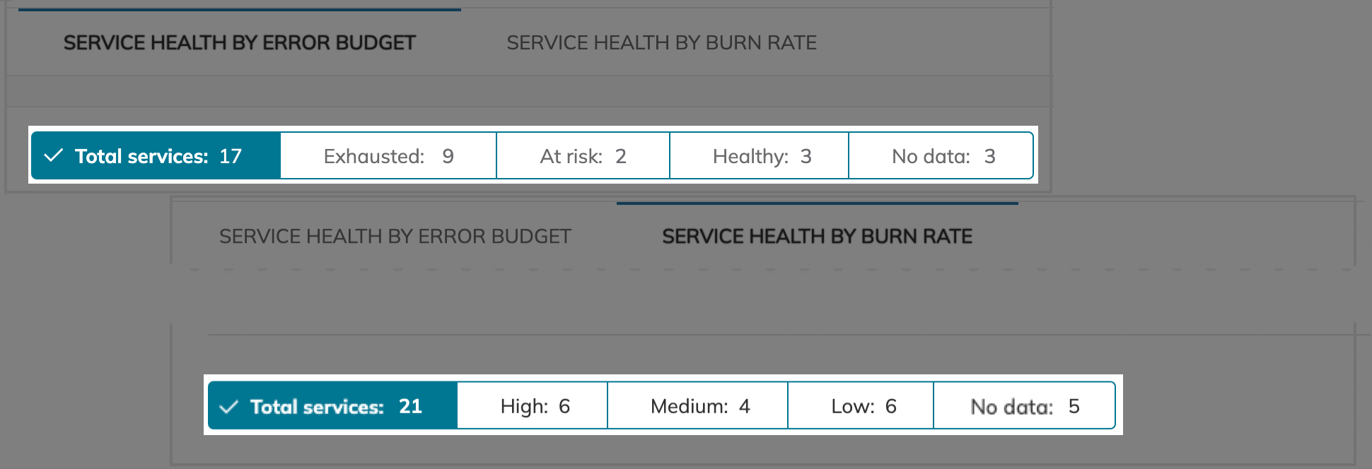
You can filter the data displayed on the Service health dashboard to see the services of your interest:
- Total
- Exhausted / High burn rate
- At risk / Medium burn rate
- Healthy / Low burn rate
- No data
or any combination of them.
For this, click the required tile or tiles in the dashboard header:
You can also filter the dashboards with labels. For this, enter labels added to services, projects, and SLOs. All applied filters are persisted in the dashboard URL. Use them as a deep link to a filtered view.
Read more about SLO search and filter logic.
Sorting
You can sort the resources on the dashboard alphabetically, by name (not considering SLO, service, or project state):
- In an ascending (A-Z) order.
- In a descending (Z-A) order.
This way, you sort all resources on the dashboard: projects, services within projects, and SLOs within services, regardless of their state.
- Service Health by error budget
- Service Health by burn rate
By default, projects are sorted by State. As a result, the display is as follows (in the left-to-right direction):
- Projects with the highest amount of Exhausted services are displayed first.
- Then the dashboard displays projects with the highest number of At risk services.
- Projects with all Healthy services are displayed last.
- Services with the highest amount of Exhausted SLOs are displayed first.
- They are followed by the services with the highest number of At risk SLOs.
- The Healthy services are shown last.
By default, the services are sorted by the highest burn rate.
When sorting by Lowest first, the dashboard assembles the groupings from the Low to High burn rate, showing the services with the lowest burn rate first within every grouping.

