Understand charts
After you create an SLO, it starts reporting data automatically. If you don’t see any data, check your data source and SLO for troubleshooting.
Once the initial data is received, Nobl9 calculates reliability metrics based on your SLO configuration. For more detailed information, visit the SLO details page.
Nobl9 builds four key SLO charts on your dashboard to visualize your SLO monitoring data for the selected time range:
- Error budget remaining: Displays how much of the error budget remains until the end of the time window you specified when creating this SLO.
- Reliability burn down: Visualizes the consumption of your error budget over the SLO's time window.
- Service level indicator (SLI): Shows data points for the selected time range. For longer time windows, the chart displays downsampled data while still calculations use raw data. The appearance of the SLI chart depends on the metric type you selected:
- Threshold metric SLI chart: Displays percentiles (p50, p90, p95, and p99) to show point distribution, indicating what percentage of data points fall below the given values on the Y-axis.
- Ratio metric SLI chart: Displays good (or bad), total, and delta data streams.
- Error budget burn rate: Visualizes the rate at which the error budget is being consumed within the SLO time window, emphasizing how quickly your service is approaching its failure tolerance limit. A burn rate of 1 means the error budget will be fully consumed exactly at the end of the time window.
Interactive features
-
Hover the mouse over the chart to view the detailed values.
-
Click and drag the chart to zoom into specific time ranges and see raw data.
-
Click the chart to add annotations: notes about events or incidents accessible from the charts.
-
Use the selectors above the SLI chart to toggle the display of corresponding values:
- Threshold metric SLI chart: Shows the percentage of data points falling under the given values on the Y-axis.
In the image, we can say that during the selected time window:- 99% of data points fall below 16
- 50% of data are under 14
- Ratio metric SLI chart: Displays data streams (good/bad, total, and delta).
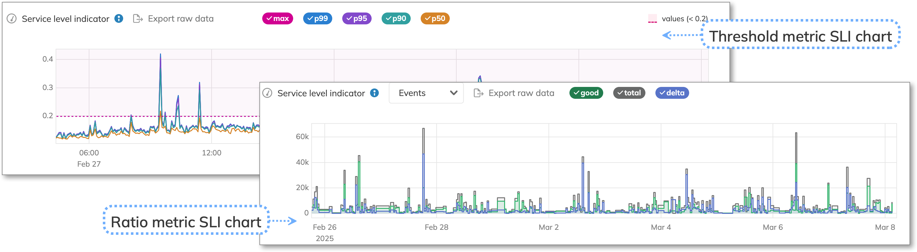
Threshold and ratio metrics SLI charts - Threshold metric SLI chart: Shows the percentage of data points falling under the given values on the Y-axis.
Delta line trend
Analyzing the delta trend line in an incremental ratio metric provides insights into error budget changes.
| Delta line trend | Good over total ratio | Bad over total ratio |
|---|---|---|
| Horizontal line | No new bad events. The burn rate is zero | All new events are bad. The burn rate is above zero |
| Ascending line | New bad events. The burn rate is above zero | |
| Descending line | Potential query misconfiguration, if counters in the data source aren't reset | |
| Zero | Same as a horizontal line. No bad events observed since the last counter reset in the data source | Same as a horizontal line. No good events observed since the last counter reset in the data source |
| Below zero | A potential query misconfiguration | |