Usability updates in Nobl9
We've introduced significant improvements to streamline the user experience for gaining meaningful insights from charts through Nobl9. This document summarizes all changes you can expect when using Nobl9 from now on.
- Displaying SLO charts for extended time windows
- Editing SLOs
- Creating new SLOs with old names
- Improved accuracy of statistical data in SLI Analyzer
- Improved experience of charts for ratio metrics (missing data)
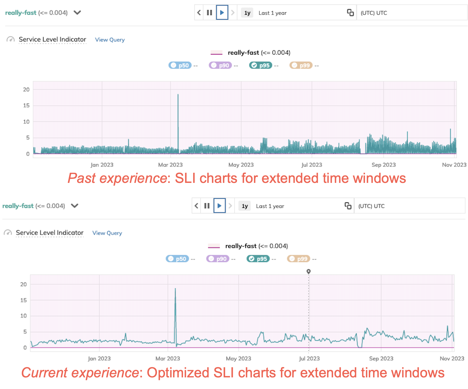
Improved aggregation of data points in charts
We've optimized the way aggregated data points are visualized in the charts. These changes improve the overall chart experience, especially for more extended time windows.
Nobl9 can now show up to two years of SLI percentile data without performance issues but with a slightly lower precision:
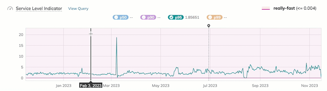
To get a closer look at your SLI chart with greater accuracy, you can still zoom in on the chart:
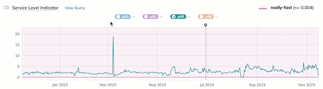
Zoom-to-drag still allows you to examine the precise raw data for timeframes as short as an hour or less:
Editing SLO threshold values
From now on, when changing the threshold value, you can preserve the SLO objective's history.
You created an SLO with 2 objectives:
- Threshold value:
1, objective-name:obj-1. - Threshold value:
2, objective-name:obj-2.
Nobl9 has gathered and processed data for both objectives for 2 days. After this period, you decide to change the obj-1 value to 3.
-
Past experience: Charts for
obj-1are reset. -
Current experience: Charts for
obj-1continue.
Editing composite SLOs
Editing burn rate values in Composite SLOs will no longer reset charts.
Creating new SLOs with pre-existing names
Newly created SLOs with pre-existing names will no longer show irrelevant data on charts.
You created an SLO called slo-1 with objective obj-1.
After several hours, you decide to delete slo-1.
Then, you create an SLO with the same name (slo-1) and objective name (obj-1) as the previous one.
-
Past experience: Charts show historical data that is unrelated to the current SLO's history.
-
Current experience: Charts show history related to the new SLO only.
More precise statistical data in SLI Analyzer
You may observe changes in the SLI values distribution chart and statistical data in the SLI Analyzer. We've transitioned from sample-based calculations of standard deviation and variation to population-based methods, which are more suitable for analyzing entire datasets.
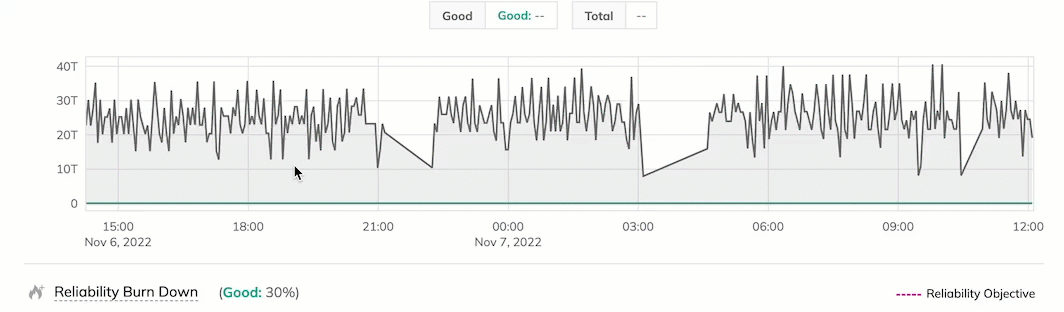
More accurate SLI charts with missing data in ratio metrics SLOs
You might also notice a difference in the SLI charts for non-incremental ratio metrics SLOs. Up to this point, Nobl9 has included artificial data points with values of 0 to represent gaps in count metric data for visualization purposes. With the recent changes, you can quickly identify periods on the SLI charts where your count metric SLOs did not capture any data.
Check the screenshot below for a comparison showing two SLI graphs for a metric representing bytes allocated for a specific service.
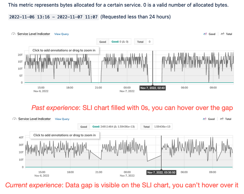
With the latest updates, you can no longer hover over periods with data gaps in your SLI data on the charts. However, when you drag to zoom in on the chart, you'll be able to examine the details of the data gap more closely: