Data import and analysis overview
SLI Analyzer runs two operations: import and analysis.
As a result of data import, you receive statistical data based on the entered parameters: data source, metric type, query, and others. The Service level indicator and SLI values distribution charts visualize imported data.
Enter the Target value to proceed with analysis. As a result of analysis, the Reliability burn down chart appears.
Import
Besides computing your actual SLO status with the configured metric and time window settings, SLI Analyzer provides additional statistical data to can help understand service performance better.
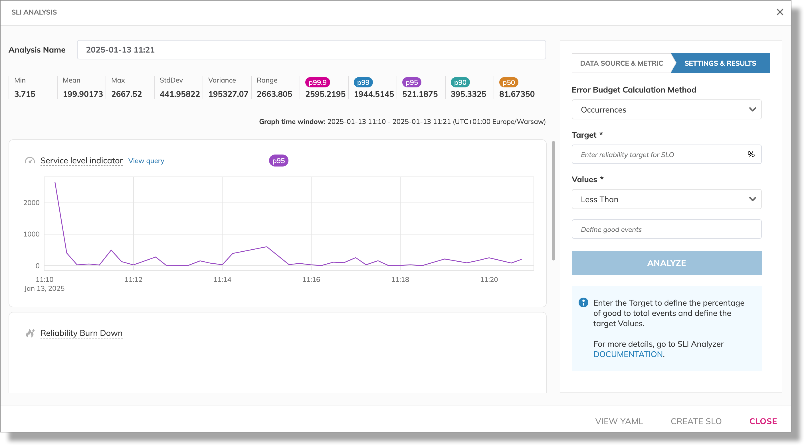
In terms of SLI Analyzer, data is considered as time series distributions. A time series distribution is a collection of data points ordered by time. Each data point is represented as a time: value pair. For example, hourly server response times would be a time series distribution. SLI Analyzer performs statistical analysis based on the distribution as a whole.
Statistical data includes the benchmark values in the distribution of SLI values returned:
Min: The lowest value.Mean: The average value. An average is a value you get when you add up all values in a distribution and then divide that by the total number of data points.Max: The highest value.StdDev: The standard deviation. A low standard deviation means most of the numbers are close to the average, while a high standard deviation means the numbers are more spread out.Variance: The statistical measure that quantifies the spread of data points from themean.Range: The delta between the highest and lowest values in the distribution (Max-Min).
Both StdDev and Variance show how much the data points vary from the mean—
low values mean the data points are close together, and high values mean they are spread out.
The difference between StdDev and Variance is as follows:
Varianceis the average of the squared differences of themeanand provides raw data.StdDevis the square root ofVarianceand presented in the same units as the original data.
In addition to the benchmark values, SLI Analyzer applies different value aggregations for threshold and ratio metrics.
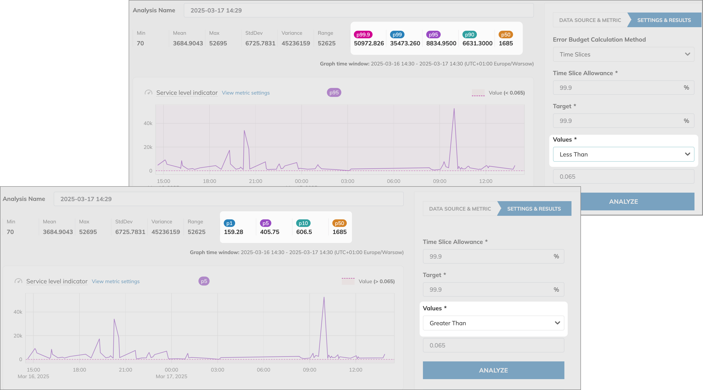
For threshold metrics, SLI Analyzer displays percentiles. The percentiles you see depend on the selected Values operator:
Percentiles vs. percentages
- A percentage is a measure in relation to 100: 40 out of 100 is 40%.
- A percentile is a statistical measure that divides the SLI values received into 100 equal parts. Each percentile represents a specific point in the distribution, indicating the percentage of data points that fall below it. If the value of the 90th percentile is 250, you know that 90% of all other data points in the distribution fall below 250.
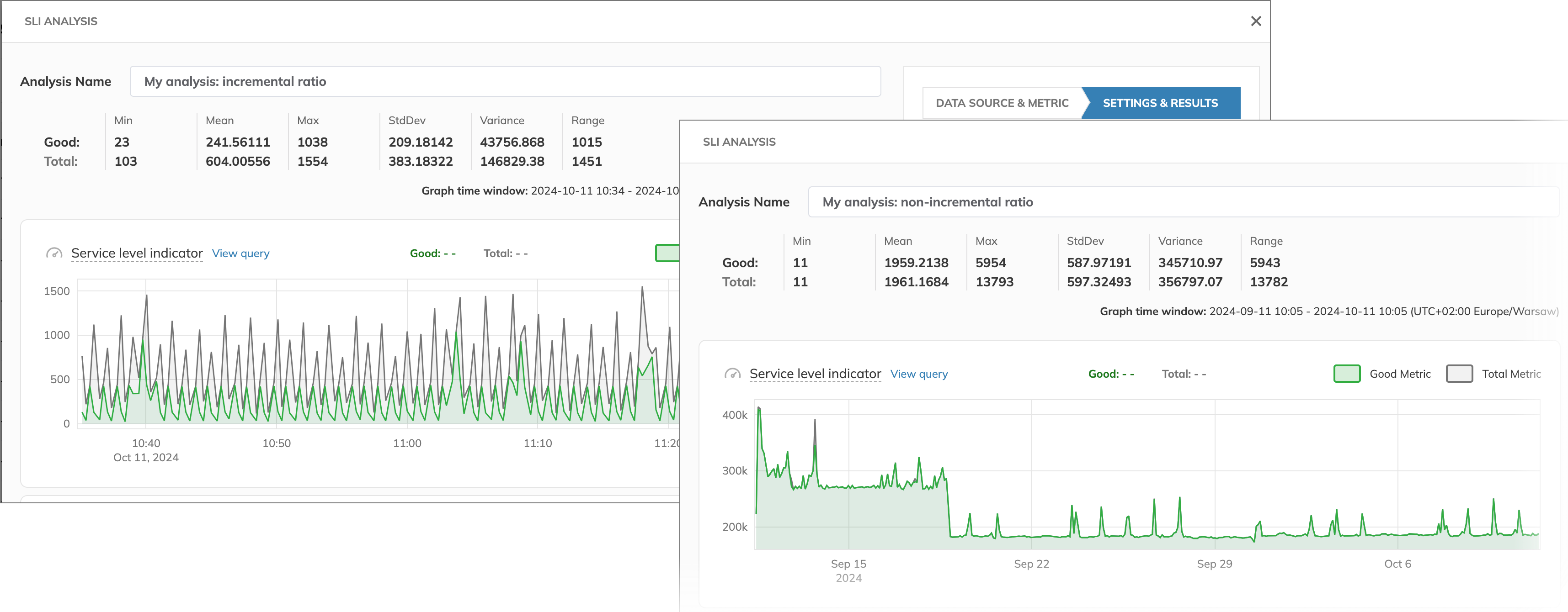
For ratio metric, it depends on the data count method: SLI Analyzer displays either the last obtained value or the sum of values:
| Metric type | Aggregation |
|---|---|
Threshold, operators > or ≥ | 5th percentile |
Threshold, operators < or ≤ | 95th percentile |
| Ratio, incremental | The last value |
| Ratio, non-incremental |
It's not necessary to consider all statistical values and percentiles when creating an SLO. However, these values provide valuable information. You can use them, for example, to assess SLI performance or track historical performance of SLI metrics.
SLI values distribution chart
The SLI values distribution chart visualizes the value distribution of data points received. Data points are grouped into value ranges for easier reading. The X-axis shows the milestone values, and the chart displays the number of data points with the same value
This chart simplifies understanding of data points received, as you can consider them in a time series distribution at once, rather than analyzing how a time series rises and falls over time.
For example, in the image below:
- Threshold metric: 5579 data points have values between 323.2 and 345.25.
- Ratio metric: 23 out of 23 total data points have values between 420.25 and 447.675

Linear and logarithmic scales
You can select a linear or logarithmic scale for the Y-axis in the SLI values distribution chart. Logarithmic scale is useful when its buckets contain a wide range of values:
Linear scale displays a wide range of values of an SLI metric:
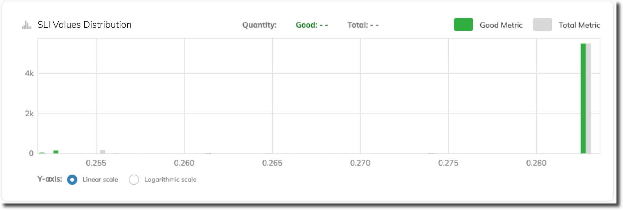
Logarithmic scale offers a more useful insight into a wide range of values of the same metric:
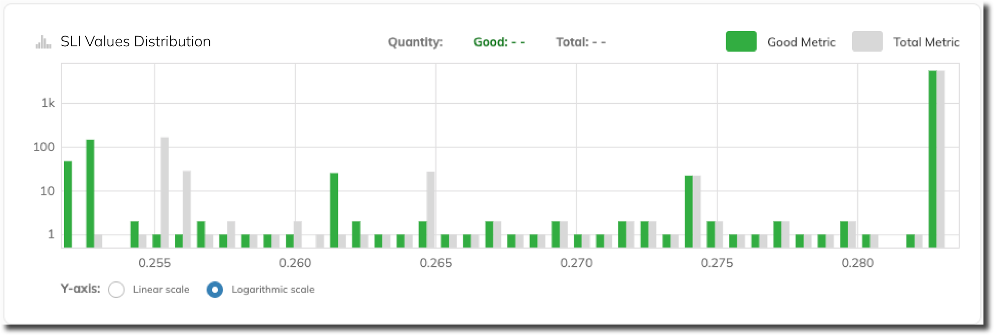
Conventionally, bucket ranges in the SLI values distribution chart are shifted: the first bucket's range starts below the minimum value of the time series:
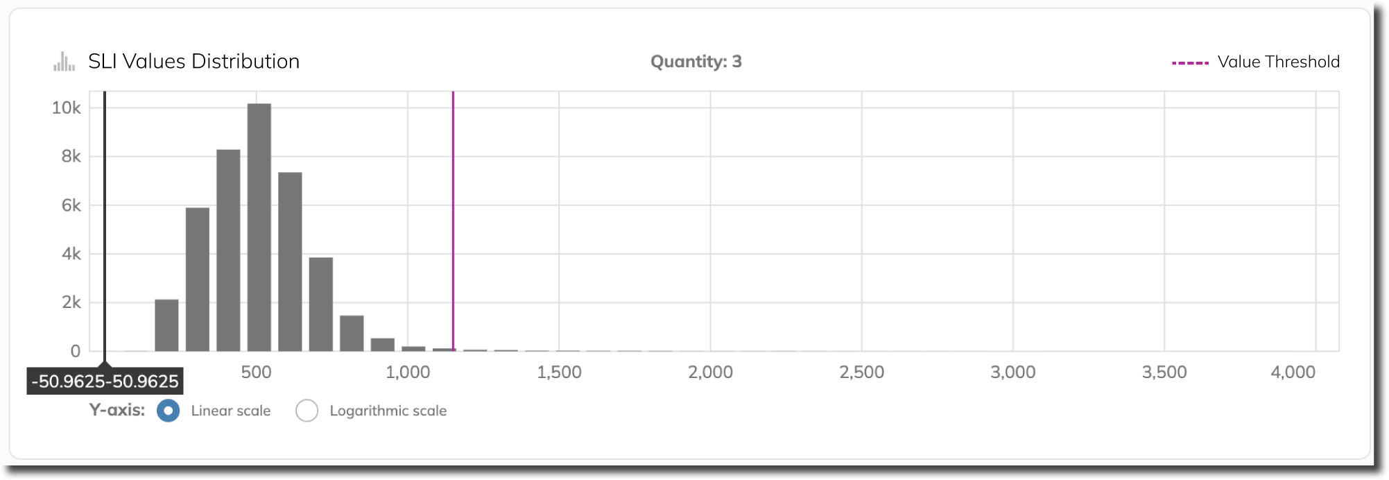
As a result, the chart provides a more accurate picture of the data distribution.
Having the SLI data imported and aggregated, you can specify the budgeting method and values and trigger analysis.
Analysis
After a successful analysis, along with the SLI and SLI value distribution charts, SLI Analyzer displays the Reliability burn down chart.
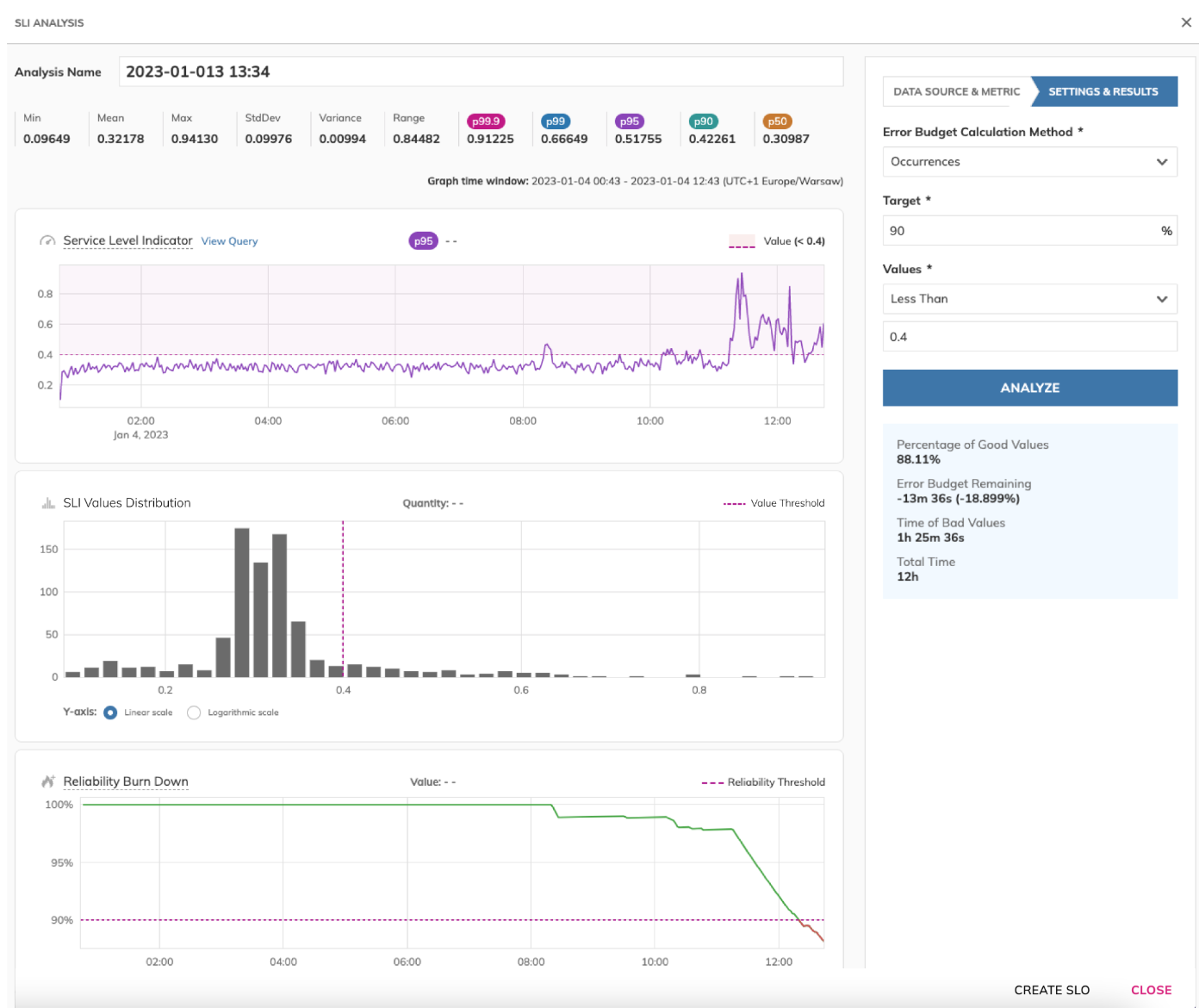
It shows how reliable your service would be over the selected time window based on the retrieved data, if the budgeting method and target are as you set.
Adjust any of the calculation parameters to assess your service reliability and elaborate the acceptable parameters for your SLO.

