SLO inputs and outputs
Service Level Objective(s) (SLOs) is a complex term that describes various components of a complex system. This document aims to clarify the inputs and outputs of reliability approaches based on SLOs and how these values are presented in Nobl9. For meaningful comparisons between outputs, they must use the same inputs.
SLO inputs
For correct SLO performance, the following inputs are required:
-
Service level indicators (SLIs): Metrics that can be used to determine if a system is currently performing in an acceptable state (or not).
-
Service level objective target: A percentage indicating the desired good state based on SLI status for events or time.
-
Time window type and duration: The evaluation period for SLIs against the defined SLO target.
-
Error budget calculation method: To determine your SLO status, two budgeting methods can be applied—event-based or time-based.
SLO outputs
Using a calculation pipeline, based on the four inputs described above, Nobl9 produces the following measures:
- Burn rate: The rate at which your service consumes its error budget, calculated as the ratio between observed bad events and allowed bad events within the defined error budget time window. A burn rate value can provide the following insights:
1indicates consumption at the expected pace- Below
1suggest budget conservation - Above
1signal accelerated budget depletion that may lead to exhaustion
- Reliability burn down: The percentage of the time a system has been in a good state, evaluated against the error budget time window.
- Remaining error budget: The ratio between the error budget consumed and total error budget multiplied by
100%for clarity:- Error budget consumed—the difference between the reliability burn down and your SLO target.
- Total error budget—the margin between perfect reliability (
100%) and your SLO target. - For example, when your SLO target is
90%and reliability burn down is95%, your remaining error budget be as follows:(95%-90%)/(100%-90%)*100=50%
To understand your system's performance, you can only compare these outputs if they are calculated using the same inputs.
Nobl9 outputs
On the grid view, Nobl9 displays:
- The Reliability burn down chart
- The Remaining error budget: time and percentage
- The Burn rate factor
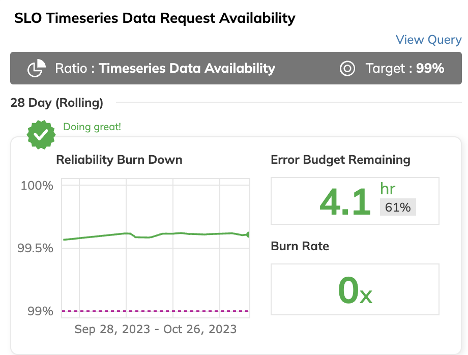
Your SLO details display three charts.
- Service level indicator displays incoming SLI data—downsampled or raw. Hover over the chart to know the exact value at any point in time:
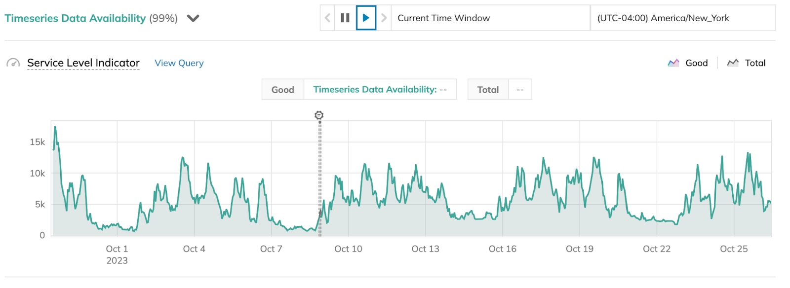
In ratio SLOs, SLI chart displays the blue delta line representing the difference between a numerator and denominator.
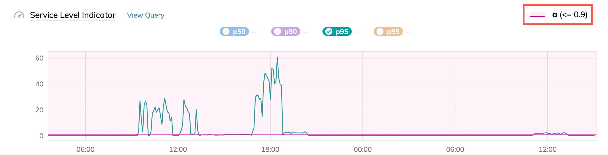
In threshold SLOs, SLI charts display the SLO target line as follows:
- For the
≤and≥target operators, the line is solid - For the
<and>target operators, the line is dotted
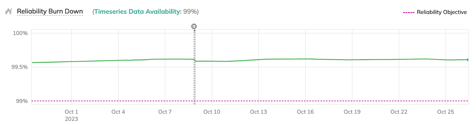
- Reliability burn down shows the exact reliability burn down value on hover. The dotted line represents your SLO target:
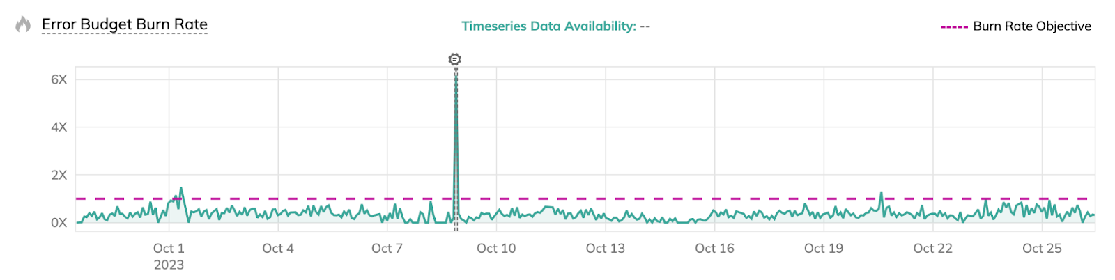
- Error budget burn rate also shows the exact value on hover. The dotted line represents
1—the100%burn rate.
When zooming in or out of an SLI chart, displayed values may change with the zoom level.
This occurs with sum aggregation on non-incremental ratio SLIs
(the Events mode),
where values represent the sum of data points per time interval:
- Zoom in: Narrower intervals contain fewer data points, resulting in smaller values
- Zoom out: Wider intervals capture more data points, producing larger values
Similar behavior can occur with rate aggregation (Events/sec mode) on uneven data streams, where each value is the sum divided by the interval's seconds.
This is how different zoom levels show the same data with different aggregation granularity.
See also: Discrepancy between Nobl9 SLI charts and data source values

